The "Mozart of modernism." (2) – Understanding Diagrams.
 The reason for the January 5th post was a bit theatrical. At the end of the referenced lecture, Jeff Kipnis added the following advice. He rushed to mention it after the usual question-and-answer session…
 [Kipnis as the crowded stirred to stand] Please! Please, please. Quickly. Do not think every tenant-occupied high-rise building with an elevator and unfinished floor plates – that’s not a modern diagram. Ok? Every carport with pipe-poles and a concrete-flat roof, that’s not a version of the Domino diagram. I mean you really must start to discriminate from the generic, accidental instances of the work, and when they start to do the work of what I was trying to discuss tonight. That is to start to do the intellectual, cultural, political, affect-based work that a field can do – because that’s what your job is. Ok?In these terms, it is hard to describe Lord Norman Foster’s Hearst tower participating in a modernist agenda, as Mr. Goldberger suggested. Almost seventy-five years after the International Style exhibit, maybe it is a little unfair. It’s also hard to defend the Hearst tower as the perfect piece of architecture the article implies. It is not a complete list, but here are some reasons why we’re still confused…
1. The decision to incorporate structure and skin in the same plane. The diagonal structure appears to create an efficiency of transferring diagonal loads, but the glazing grid trips over those larger members. Unlike the Swiss Re Headquarters, the glazing mullions on the Hearst tower are necessarily vertical to conceal interior partition walls that meet the glazing. This clash of grids means approximately one third of every installed glazing panel has specially cut shape. The result is a harmony that trips over itself and is constantly being interrupted.
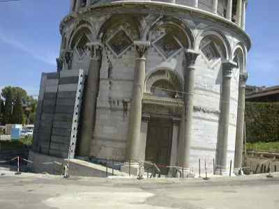
2. A suppressed relationship to the city. First, this building doesn’t really touch the ground, rather, it seems to float above the city. The original art deco Hearst building still mediates between the tower and the north, east, and south sidewalks that surround the site. Cleverly the old five-story building is kept as a skirt or pedestal for the new tower to hover on. This solution removes the need to resolve the crisscrossing geometry’s intersection with the ground, with people, and with the city. But it also removes any haptic exterior interface with that showcased geometry. Like television images or photographs of lost loved ones, you can see, but not understand by touching, leaning, pushing, or climbing. It sounds like an odd statement at first, but consider the Leaning Tower of Pisa, the Twin Towers, the Washington Monument, or Rome’s Pantheon with a fifty-foot skirt at their bases.
Second, the “diagrid” does not reveal anything, as one gets closer. Unlike medieval cathedrals, which reward approaching pilgrims with finer and richer details as they draw near, the Hearst tower can be well understood from six blocks away. No fasteners, resolved details, or rich textures reward walking closer. In a sense, the building spends most of it’s capital speaking at the scale of the city, and almost none at the scale of the block. As a counter-example, consider the Seagram building’s attached steel columns or plane of overhead lights -- which are important to the ephemera of floating floor planes. No such detail is presented at Hearst.
Finally, like a geode, the inside of the Hearst tower is unexpectedly different from the smooth, evenhanded exterior. After entering through the (restored) coffer-arched east entrance, one moves into the heart of the building and faces a ramped wall blocking flow from the doors. A visitor is also greeted with ¾ view of an escalator, which in plan reaches diagonally down slashing across the column grid. The escalator takes visitors to the northwest corner of the building, delivering to a second level atrium, which also pushed off the grid. What these circulatory exceptions signify remains to be seen.
It’s regrettable that such a playful architect’s work should be the battleground for this complaint about journalism. An admirable quality of the building is how this triangulation is used as more than just an iconic shorthand. It is splendid how the global geometric pattern allows the façade to act topologically like a cylinder, replacing all the corners for a tessellated solution. (Corners are where many buildings are resolved or are most expressive.) This is a familiar theme in architecture, and one Mr. Foster is cleverly exploring. It is pleasant to see this high performance skin while others obfuscate the “surface” discussion to justify complicated folds and irregular blobs. If a “modern” diagram must be applied to this building, perhaps it was meant in the Maison Domino mode -- the one that Kipnis’s quote cautions us about. Upon reflection, it is proposed in this forum that the building is discussed in the league of many recent surface discussions instead.
There is irony that the battle is started and the building isn’t even finished yet. However, at issue here are two ideas almost unrelated to the Hearst tower.
First, if architectural journalism strives to present the ideas, events, and issues similar to other forms of journalism, then it must present the good with the bad. This post is an attempt to take a competing view of Mr. Goldberger’s to illustrate that missed opportunity. Readers deserve balanced and competing views of what such buildings mean. Initial reactions about Mr. Goldberger’s article may have been automatic responses to this imbalance.
More importantly, “modern” is a dangerous, unwieldy label. Mr. Kipnis’s insistent scolding is welcomed, and happily repeated. When writing for the general public, or for the architectural community, it is best to explain what one means with this oft-misused word. Building off the last paragraph, there is wisdom in describing what specific idea one is referencing with “modern.” This adds specificity and set an ideological playing field on which to discuss the work.
posted by J at 1:09 AM
![]()

5 Comments:
These are very interesting comments, J. I agree with your cautioning to the use of "modernism." Why is it that more specific terminologies haven't yet surfaced? I'm saddened that you noted Mr. Foster's actual tower has little to do with the debate. Are you so pasionate about the tower because you worked on it?
This is an important issue if the profession is ever to gain more respect. Architects uniformally complain about not getting paid like other professions. This is because most people don't know how to value an architect's woork.
Personally, I've hired a doctor scores of times in my life, I've hired a lawyer a couple of times in my life, and I've never hired an architect. That's the norm.
That's why architectural journalism is important. It brings to the table the important issues surrounding the built environment, for a community discussion. It also primes or future clients, and helps value our work.
Here, here! This is a far nicer review of the Hearst Tower! I reiterate my previous commment, "Why don't newspaper editors just farm blogs for good critics?" I'd like to see some Do-You-Want-Coffee-ers at the New Yorker! Keep up the good work here, guys. This was a stand-up series of posts.
Maybe critics should have images of their own buildings posted too. That way people can have a shot at the crit's building too!
Frank is frank
Dear frank, blite, et al.,
Thank you for your comments. They were all welcomed.
To answer some questions, no I didn't work on the tower, but would be honored to work in the Foster office, they are doing some great projects.
I think more specific terms other than "modern" have surfaced, but are too specialized to be considered safe for non-architect popular-press consumption. Althought I didn't mean it, I think you may have a correct reading of the situation here. It would be nice to circulate a deeper vocabulary of labels, instead of the shorthand we're all guilty of -- citing designers as a reference to a style. "Gehry-esque" blobs, or "Zaha-eque" angles. Hmmm. Food for thought.
I don't know why print editors don't hire bloggers, but I've thought of the possibilities myself. Blogging is still very new. I've noticed a lot of Professors and established architects landing the more traditional role of newspaper columnists, and blogs like DYWSC? Gravesmor, Tropolism, etc. are not part of that establishment. Arguably, we could be up-ending, or overturning that establishment. I'm entirely speculating here, but this could be why newspapermen keep their distance. Interestingly, bloggers are getting book deals left and right though... that's a pretty established medium. Hmmmm...
Finally, I wonder if putting pictures of my (sadly, not built) work up would change the debate. Its a pretty slow discussion to wait for a building to be constructed in order to feel validated in making a comment. I wonder if The Gutter would suddenly go quiet! Another nice angle about blogging, anonymous or not, is that it abstracts the discussion(s). Everything is quotable, and timing and the need for physical presence are secondary to what people write. I look forward to seeing what happens in the world of blogging in the next year, after 2005 treated us so well.
Thanks again to all,
J
PS. Are you guys having trouble with the word varification? I just can't read the letters sometimes.
Post a Comment
<< Home